

The Map That Made Africa Look Smaller
The UN promotes maps that preserve continental proportions, reopening a debate about geography, perception and power
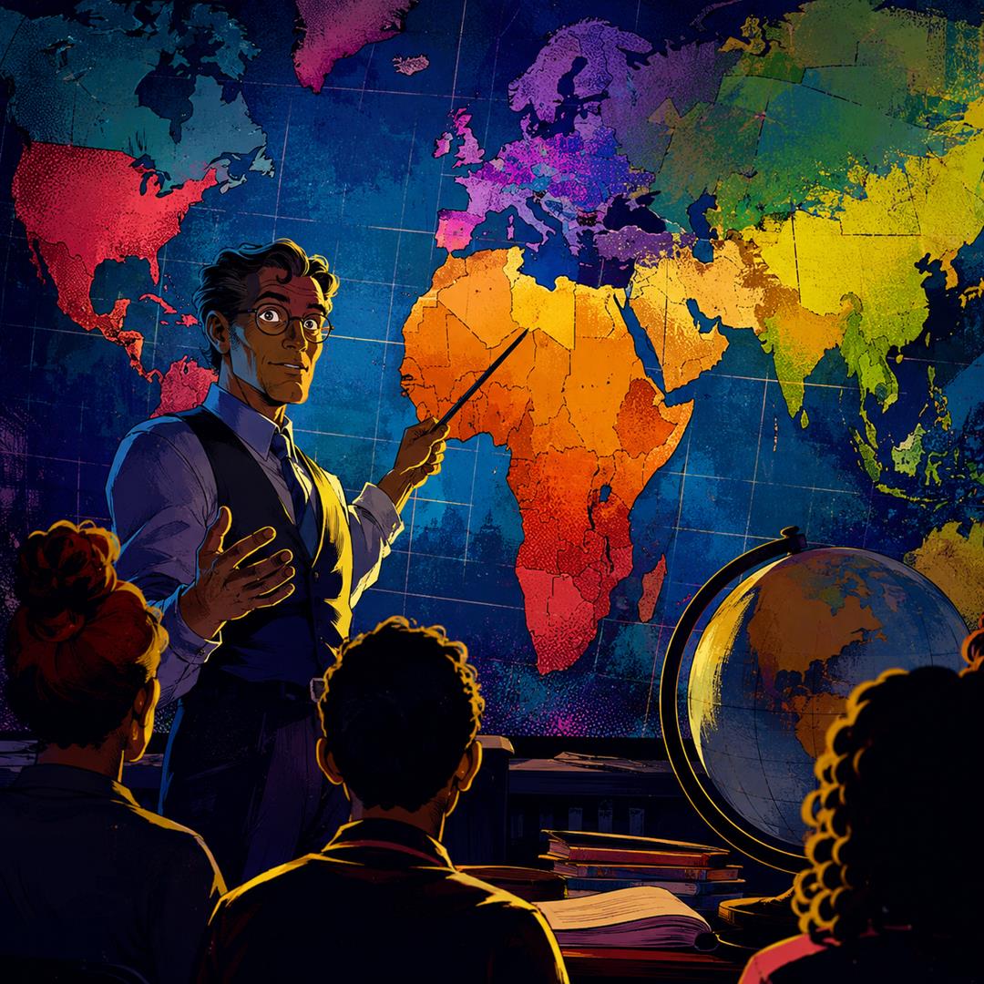
Imagine a classroom. On the wall, there is a world map: Europe at the top, Africa in the middle, North America on the left, Asia stretching across the right side and Antarctica at the bottom, looking a little like a white rug someone forgot to put away. Now imagine the teacher pointing at Africa and asking: “Do you think it is really that size?” The answer would probably be yes. After all, that map has been hanging there for decades, in schools, books, newspapers and on...
🔒
This article is for premium readers only.
Support quality publishing and gain unrestricted access to our full library.
Sign in / Up to your Account:
📰 Continue Reading:


Share this exclusive article:
Filed under: insights & data | DonateToRead